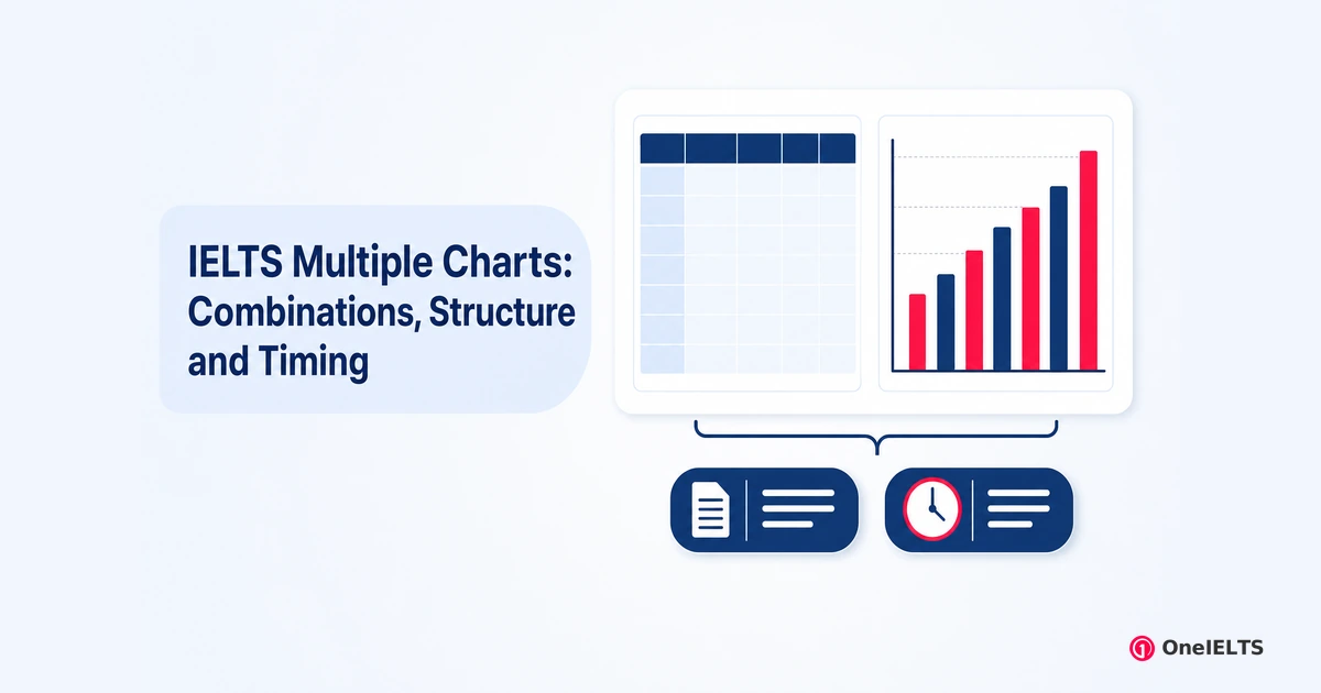
A multiple chart question hands you two visuals in one prompt, most often a table beside a chart, and still asks for one report of at least 150 words. Before writing, settle the decision the answer turns on: must you compare them, or may you describe them separately?
The rubric asks for comparisons where relevant, so relevance decides, not you. Two visuals that share a category set, a period or a shared axis carry a real link. Two that share none of those do not, and forcing one costs marks.
The visual has not changed; the word budget has. This guide covers the combinations, whether to compare, which chart goes first, the overview, the body paragraphs, the data you can drop, the timing, the mistakes, the sample answers and practice. A mixed chart prompt and a combination graph name the same question.
What Is a Multiple Chart Question in IELTS Task 1?
A multiple chart question is an Academic Writing Task 1 prompt that carries two visuals in one question, such as a table with a bar chart or a pie chart with a line graph. It still asks for one report of at least 150 words covering both.
Three names describe the same prompt. A mixed chart prompt, a combination graph and a multiple chart question all mean two visuals in one question. The distinction matters, because a candidate who has met only one name does not know they have found the right page.
Start with the reassuring half. The marking criteria, the 150-word minimum and the 20 minutes are identical to a single-visual question. What changes is volume. The data roughly doubles while the budget holds still, so data selection stops being a skill you bring and becomes the task itself.
One confusion in the search results deserves a direct answer, because two ranking pages display it. A multiple chart question shows two data visuals. A map question or a process diagram belongs to a different type, even when a sample bank files it under the same tag.
The shared rules, the four criteria and the four-paragraph frame belong to the IELTS Writing Task 1 hub.
Which Chart Combinations Appear in IELTS Writing Task 1?
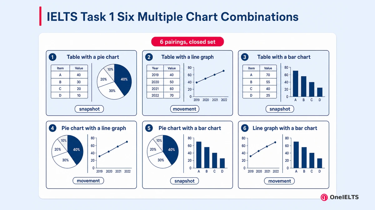
Six pairings cover almost every multiple chart question the exam sets, and they form a closed pairing set rather than an open one. The commonest by far is a table paired with a chart.
The list is worth printing for one measured reason. The only source on this search that gives a closed list gives it in Vietnamese, under a heading, on a test owner’s own site. Every English-language guide offers an open-ended version instead, and one of them ends its list with etc. So the useful list exists on this search and an English-reading candidate cannot reach it.
Each pairing changes a different thing about the answer, and they are ordered here by how often they turn up.
- Table with a pie chart: the table carries the detail and the pie carries the proportion, so the table is where you must be selective
- Table with a line graph: the table is usually a snapshot and the line is the movement, so tenses differ between your two body paragraphs
- Table with a bar chart: the commonest pairing in published guides, and the one where both visuals invite too many figures
- Pie chart with a line graph: a proportion beside a trend, and the pairing least likely to share an axis
- Pie chart with a bar chart: two snapshots and no trend, so the report turns comparison-heavy and movement-light from the first line
- Line graph with a bar chart: both carry change over time, so this is the pairing most likely to support a genuine link
Three of the six are table with chart pairings, which is why most candidates meet that family first. The pie and line pairing is the one least likely to share an axis, while the bar and line pairing is the one most likely to support a genuine link. Every combination reduces to the same question: snapshot versus movement.
Two visuals of the same kind also appear, such as two pie charts or one chart split into two panels, and they follow the same rules. The six pairings are the set published by a test owner’s own guidance for this question type.
Is It Necessary to Compare Multiple Graphs or Can You Describe Them Separately?
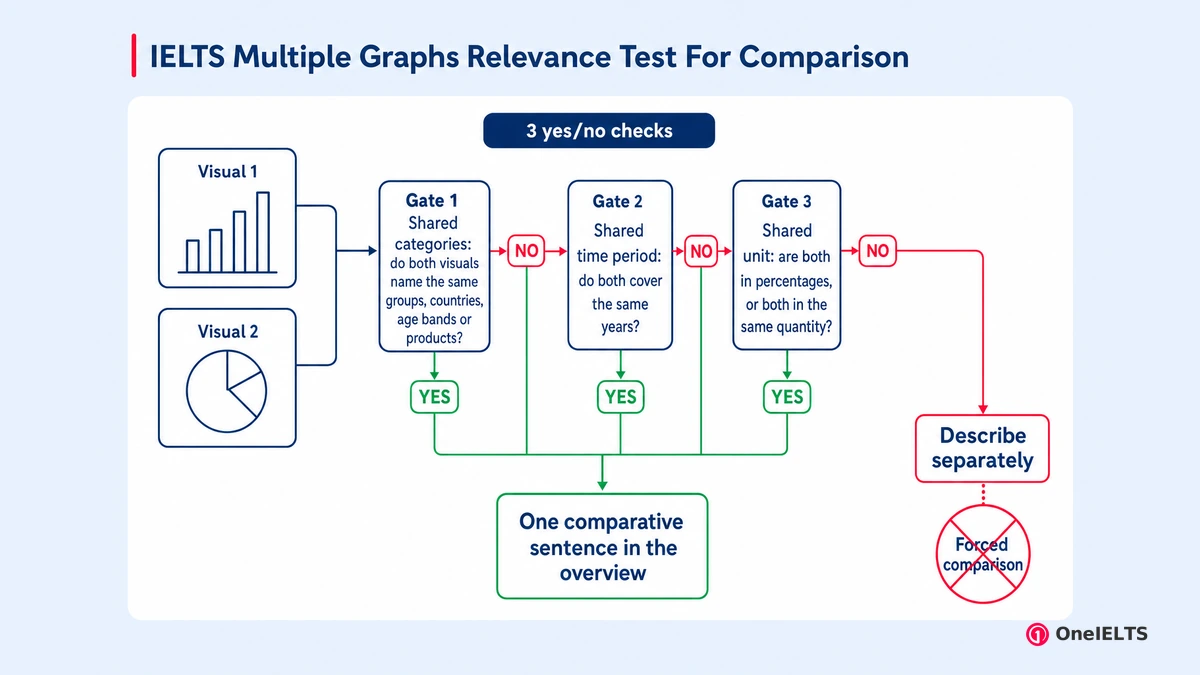
Compare where a comparison is relevant, and let the data decide relevance rather than you. A shared category set, a shared time period or a shared unit means a comparison exists, and leaving it out costs you. Share none of the three and a forced link costs you more.
You have probably met two contradictory versions of this already, so the disagreement is worth naming. One widely read guide states that you must compare the graphs to show you can put information together. A test owner’s own guidance requires at least one point of comparison between the two charts. A third asks you to compare the features when it is appropriate, without ever saying when that is.
The highest-ranking page on this question type never mentions comparison at all. Its only structural instruction points the other way: the body paragraphs will be split between each task.
The task instruction settles it, and almost nobody quotes the settling words. IELTS prints them above every Academic Task 1 prompt.
Summarise the information by selecting and reporting the main features, and make comparisons where relevant.
Relevance is the condition, so relevance is what you test. The relevance test takes three questions and about thirty seconds.
- Shared categories: do both visuals name the same groups, countries, age bands or products? If yes, you can say how a group ranks in one and behaves in the other
- Shared time period: do both cover the same years? If yes, you can say what happened in one while the other was changing, and the link is chronological, not causal
- Shared unit: are both in percentages, or both in the same quantity? If yes, a figure from one can sit beside a figure from the other without misleading anyone
Three no answers mean you describe the visuals separately and connect them only with a sentence saying what each shows. One yes or more means at least one comparative sentence is expected, and it belongs in the overview.
Now the warning nobody writes. Across every guide captured for this page, the phrases different units, same data and no comparison appear exactly zero times.
So no page tells you that comparing two charts in different units is not a cohesion problem at all. It is an accuracy problem. A sentence placing a percentage beside a raw quantity, as though they measured the same thing, states something untrue. A manufactured comparison invents a claim the data does not support, and it costs Task Achievement rather than Coherence.
Two worked examples show the line. Legitimate: the country spending most in the bar chart is also the one whose line falls fastest across the same decade. Illegitimate: the largest slice of the pie chart, at 40 per cent, is bigger than the table’s highest figure of 3.2 million tonnes.
Which Chart Should You Describe First in a Mixed Chart Answer?
Describe the visual carrying the bigger story first, not the one printed on the left. In practice that is usually the trend visual, because change over time gives the reader a frame that a snapshot visual cannot.
The question earns a section because nothing on this search answers it. No captured guide states an ordering rule, and every worked model on the page silently picks one anyway. One guide’s own commentary notes that it concentrated on the bar chart first and focussed on describing the most significant feature first, without ever saying that was a choice.
Four cases settle the order: the trend rule, a tie-break on size, prompt order, and one thing never to do.
- Default: the visual showing change over time goes first, because a trend gives the report its shape and the snapshot then explains part of it
- If neither shows time: the visual with fewer categories goes first, because it is quicker to state and leaves more budget for the busier one
- If the question sentence names one first: follow the question. The examiner reads the prompt before your answer and the order feels deliberate
- Never: do not start with the visual you understand least, hoping the second rescues it. The first body paragraph sets the register for the report
Whichever visual you take first, keep each one to its own paragraph. A test owner’s guidance in the capture is explicit that describing both inside a single paragraph destroys the cohesion of the answer.
How Do You Write the Overview for Multiple Charts?
One overview, not two. A single overview carries the biggest feature of each visual, plus the link between them if the relevance test found one. Two separate overviews read as two reports stapled together.
For once the sources agree, and that is worth knowing. Every captured guide that gives an overview instruction for this type gives one overview covering both visuals, and not one page tells you to write an overview per chart.
Four things belong in that paragraph and nothing else does.
- The single biggest feature of the first visual, stated in general terms, with no figures and no supporting detail
- The single biggest feature of the second visual, given the same figure-free treatment and the same one sentence of space
- The link between them, one clause only, and only when the relevance test above returned at least one yes answer
- Nothing else. Two to three sentences is the whole paragraph, and it is the paragraph that decides whether the report can pass
Overview position splits the captured guidance, and one page offers it either straight after the introduction or at the end of the report. Put it second. A candidate who runs out of time has then already written the paragraph carrying the most weight.
Begin it with a signal word so it is impossible to miss. One captured guide states the instruction plainly, telling readers to start the overview in a clear way, for example with Overall.
The overview is a figure-free summary, and that is the half candidates get wrong. What an overview is, and why every Task 1 report needs one, belongs to the IELTS Task 1 overview rules.
How Do You Organise the Main Body Paragraphs for Multiple Charts?
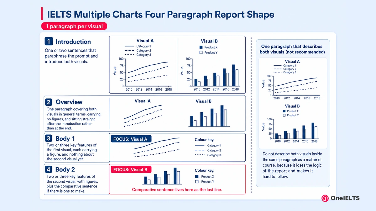
Two body paragraphs, one per visual, with the comparison living in whichever paragraph comes second. Splitting by visual is what the highest-ranking page and a test owner’s guidance both do, and one paragraph per visual is the only split that stays readable under 200 words.
The four-paragraph shape fixes what each part carries.
- Introduction: one or two sentences that paraphrase the prompt and introduce both visuals. A reader who meets only one has been misled from the first line
- Overview: one paragraph covering both visuals in general terms, carrying no figures, and sitting straight after the introduction rather than at the end
- Body paragraph one: two or three key features of the first visual, each carrying a figure, and nothing about the second visual yet
- Body paragraph two: two or three key features of the second visual, with figures, plus the comparative sentence if there is one to make
One guide names an alternative: group similar information across the two visuals into a single grouped paragraph when they are connected. It can work. It needs a genuine shared axis and it is much harder to keep accurate under time pressure, which makes it a band 8 move rather than a default.
A test owner’s guidance states the ban plainly. Do not describe both visuals inside the same paragraph as a matter of course, because it loses the logic of the report and makes it hard to follow.
An introduction covering both visuals is not optional either. The comparative sentence has to carry a relationship rather than a repetition, and a sentence that only restates a figure the reader already has is not a comparison at all.
Can You Skip Minor Trends or Data Points in Multiple Graphs?
Yes, and on this question type you must leave detail out. Two visuals carry roughly twice the data of one while the word budget stays where it was, so figure selection is not a shortcut here. It is the skill being marked.
Category coverage cuts the other way, and that boundary stops the advice becoming bad advice. Every category in each visual should be accounted for, even if only inside a group. Individual figures should not be. Omitting a whole category reads as not having seen it.
Five decisions cover almost every prompt: two things to cut and three to keep.
- Cut: every figure that is neither the highest, the lowest, nor the biggest change. Two or three figures per visual is normal at band 7
- Cut: the middle of a trend. Give the start point and the end point and the shape between them in one word
- Keep: the extreme value at each end of both visuals, because the overview depends on them and cannot be written without
- Keep: every category, at least by name or inside a group, so nothing in the prompt looks unread by the examiner marking you
- Keep: one figure that supports the comparative sentence, but only when the relevance test gave you a comparative sentence to make
Keep both trend endpoints and drop the middle of the line, because the shape between them fits in a single word. Then run the sanity check that turns the rule into an action. Write the answer, count your figures, and treat more than four in either visual as a warning. That count settles reporting versus selecting better than any rule of thumb.
How Much Time Should You Spend on a Multiple Graph Answer?
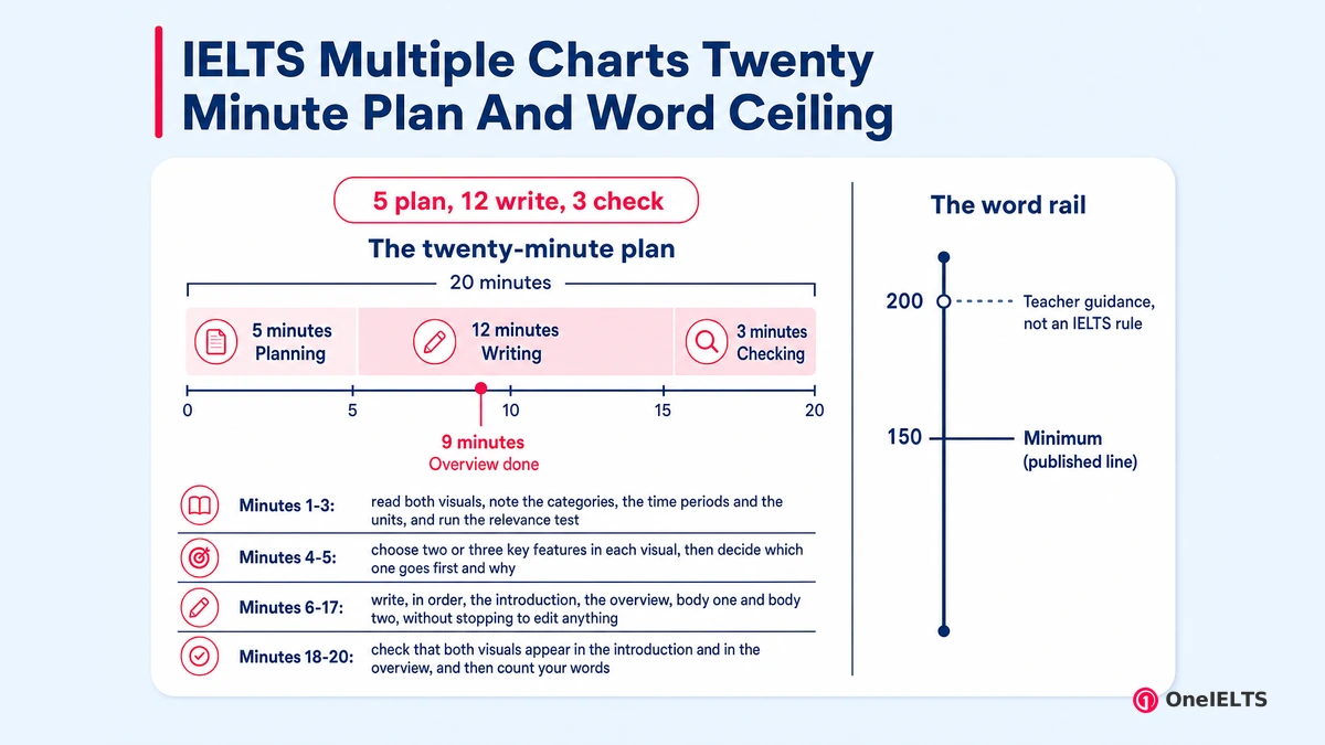
Twenty minutes, exactly as for any Task 1 question, but the split inside those minutes moves towards planning. Five minutes reading both visuals and deciding whether a comparison exists, twelve writing, three checking.
The twenty-minute plan for this type buys more planning time up front than a single-visual answer needs.
- Minutes 1-3: read both visuals, note the categories, the time periods and the units, and run the relevance test
- Minutes 4-5: choose two or three key features in each visual, then decide which one goes first and why
- Minutes 6-17: write, in order, the introduction, the overview, body one and body two, without stopping to edit anything
- Minutes 18-20: check that both visuals appear in the introduction and in the overview, and then count your words
Length is the other half of the question, and it needs careful attribution. The 150-word minimum is published and unchanged for this type. A word ceiling is not published by IELTS at all. The single highest-ranking page on this question type advises keeping a two-visual answer under 200 words, and its own model answer runs to 194.
Treat that as an experienced teacher’s practical guidance rather than an IELTS rule. It is sensible guidance, because past roughly 200 words a two-visual report is almost always reporting figures instead of selecting them. Going over the count is a separate question, and the IELTS Writing Task 1 word count page answers it.
The plan above only proves itself under real timing, which is what a timed IELTS Writing mock supplies. A timed report is also the only way to find out whether your overview really lands at minute nine.
What Are the Common Mistakes to Avoid in Multiple Graph Answers?
Five mistakes account for most of the marks lost on this type, and three of them exist only because there are two visuals rather than one.
A forced comparison and a missing overview cost the most, and both are decided before you write a word.
- Writing a single-visual answer. Published guidance is explicit that a report covering one of the two cannot meet Task Achievement. Fix: name both in the introduction
- Forcing a comparison that is not there. Fix: run the relevance test first, and if all three answers are no, describe them separately and say nothing more
- Describing both visuals inside one merged paragraph. Fix: one paragraph per visual, always, unless you have a genuine shared axis and time to spare
- Leaving out the overview, or writing one for each visual. Fix: one overview covering both visuals, placed straight after the introduction and before any figures
- Running long because there is more data on the page. Fix: cut figures, never categories, and check your count before you check your grammar
The mistake nobody lists is a unit mismatch. Putting a percentage from one visual beside a raw quantity from the other, inside a single sentence, reads as a comparison and marks as an inaccuracy.
The general Task 1 error list belongs to the IELTS Writing mistakes page, which covers the ones that have nothing to do with having two visuals.
Where Can You Find Multiple Chart Sample Answers?
Read a model answer for its selection and its paragraph split, never for its sentences. A two-visual model answer is mostly a record of what its writer chose to leave out, and that is the part which transfers.
The demand on this search points two ways at once. Five of the eight related searches on this question type ask for samples, answers or prompts, and not one asks how to structure the answer. Meanwhile the only real on-page FAQ on the topic asks four questions and every one of them is about method.
Four things are worth extracting from any model you open.
- Count the figures in each body paragraph. That number, not the vocabulary, is what you are actually trying to copy
- Find the overview and check whether it links the two visuals. If it does, work out which of the three shared axes let it
- Note which visual the writer took first, then ask whether the trend rule above explains the choice or whether it was arbitrary
- Ignore the sentence patterns entirely. A phrase that fits one pairing of visuals rarely fits another, and copied phrasing shows
Sample banks deserve one honest warning. The tag a bank files a question under is not always right, and one of the largest collections on this search files pure map questions under its multiple-chart heading. Check that the prompt shows two data visuals before you use a mislabelled prompt as practice for this type.
The figure count is the transferable part of any model, and the selection pattern behind it is what you are reading for.
How Do You Practise IELTS Multiple Chart Questions?
Practise the decision before you practise the report. On this type the answer is decided in the first three minutes, so drill the relevance test on ten prompts before writing a single full report.
Five steps make up the routine, and the first is the one candidates skip.
- Take ten multiple chart prompts and write three words for each: the shared category, the shared period and the shared unit, or none
- For the ones with at least one shared axis, write only the comparative sentence. One sentence, ten times, is twenty minutes well spent
- Now write one full report untimed, then count the figures in each paragraph afterwards and mark anything above four as excess
- Then write two more in twenty minutes each, and check the clock at the moment you finish the overview: it should read about minute nine
- Mark your own report for Task Achievement first: did both visuals appear in the introduction, in the overview, and in a paragraph of their own
Step one is the relevance drill, and it needs its reason stated. The mistake this type punishes is a comparison that is not there, and that mistake is made before any writing starts. Ten decisions cost less time than one report and fix more.
Step one also needs a prompt set, and IELTS multiple graphs practice filters prompts to this single question type. Loose worksheets cannot tell a multiple chart from a map. Practising needs a free OneIELTS account.
The figure count check in step three and the self-marking in step five catch different failures. One catches a timed report that reported instead of selecting. The other catches a report that quietly dropped a visual.
How Do You Write the Introduction for Two Charts?
One or two sentences that paraphrase the prompt and name both visuals, what each shows and the time period each covers. An introduction that mentions one visual has already misled its reader.
One structural pattern always works without becoming a template to memorise. The two charts show X; the first gives A and the second gives B. It works because both visuals named up front give the reader the report map, before any figure arrives.
Introduction length is guidance rather than a rule: one to two sentences maximum, and the shortest share of your twenty minutes, because the overview and the body paragraphs carry the marks. A prompt paraphrase that runs to four sentences has spent budget the overview needs.
Paraphrasing a prompt is a Task 1 skill rather than a multiple chart skill, and the IELTS Writing Task 1 page teaches it.
Which Vocabulary Covers a Table and a Bar Chart Together?
The same data-change language as any Task 1 answer, plus a small set of phrases whose only job is to move the reader from the first visual to the second.
That small set is the one word group this page owns, because it exists only when two visuals arrive together. A neutral transition does exactly what its name says: turning to the second chart, as for the pie chart, the table shows a different picture. It performs a subject change and claims nothing about a relationship.
A comparative connector does the opposite. It carries an implied link, so it is only safe once the relevance test has returned a yes. Reach for one when the two visuals share an axis, and reach for a neutral transition when they do not.
The data-change word set itself has its own page, and the IELTS Task 1 vocabulary page prints the lists.
Which Grammar Do You Need for Tables and Bar Charts?
The tense follows each visual separately, not the report as a whole. The rule is per-visual tense, and it is the one grammar problem that appears only when two visuals are paired.
A table giving a single year needs the past simple, while a line graph running to the present may not. So the two body paragraphs of one report can legitimately sit in different tenses. A writer who unifies them makes one of the two inaccurate, and a tense mismatch of that kind is correct here rather than careless.
The second pairing-specific point is shorter. When the visuals share categories, the comparative form and the superlative form do real work. When they share nothing, both forms state a claim you cannot support. General Task 1 grammar belongs to the hub.
Where Can You Find Multiple Chart Practice Questions?
On a practice set filtered to this single question type, so every prompt you open really does carry two data visuals.
Filtering matters more here than on any other chart type, and the reason sits in the search results themselves. Sample collections file map questions under multiple-chart tags, so an unfiltered prompt source returns prompts that train the wrong skill. A filtered practice set does not have that problem, because the question-type filter is applied before you open anything.
A mislabelled prompt costs you twice: the practice time, and the wrong pattern you carry into the exam. IELTS Writing Task 1 multiple graphs practice opens only this type. Practising needs a free OneIELTS account.
One thing to check before you start. A practice link carries the question type but not the exam type, so set the exam type in the left rail if you have been working in General Training mode.
Written by Jamil Ahmed, reviewed 14 August 2026.
Last verified: 14 August 2026
Practice for the Real IELTS Exam
Apply what you’ve learned with free, exam-style practice:
- Take a free IELTS mock test — all four skills, real exam timing, AI band scoring
- Sit a Writing section mock — Task 1 and Task 2 in one timed hour with a band estimate
- Practise by question type — self-paced Writing sets with model answers